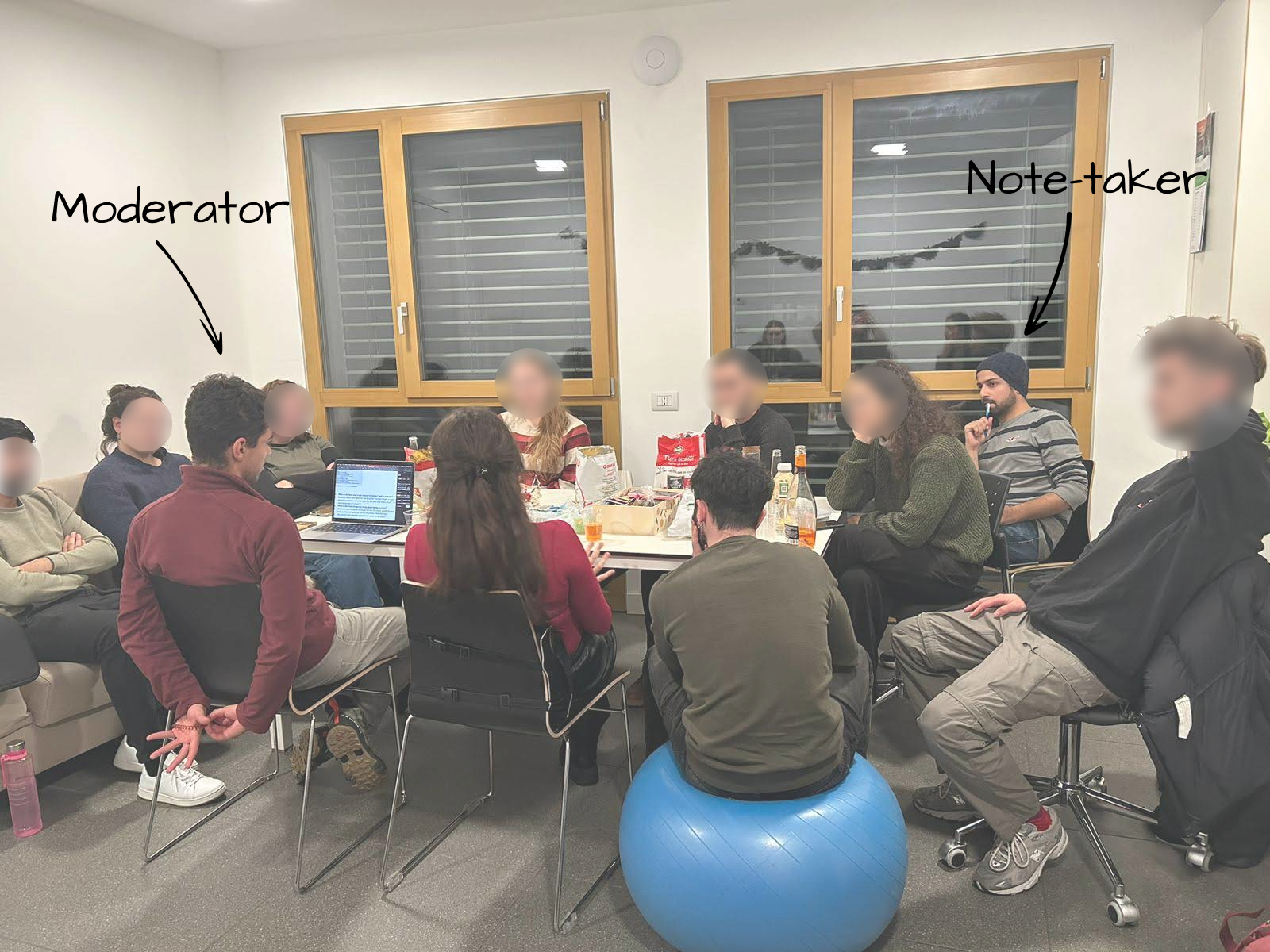
Context
University Project Work
Duration
Two Weeks
My Role
Research
Team
Just me
Abstract
The goal of this study is to validate a proposed modification to the user interface of GoPro Action Cameras.
The modification aims to improve discoverability in a specific task with minimal changes to the UI.
The task we aim to improve involves finding and opening the video gallery, where users can play back previously recorded videos. This may seem like a minor task, but it is an important feature of the camera and, as shown in this study, suffers from discoverability issues.
To do this, an alternative, slightly modified interface is created and tested against the original one.
The goal was to assess and mitigate discoverablility issues in one specific task: opening the video gallery.
Introduction
Currently, when the user is in the “main screen”, the video gallery can be opened with a swipe up gesture.
By doing so, the user will see the video gallery appear from below and slide up to fill the screen. There, the user can play previously recorded videos.
To close the video gallery and go back to the main screen a swipe down gesture is used.
However, although the main screen affords this swiping gesture to open the video gallery, there is no element that indicates “swiping up” as a possible way of interacting with the device: i.e. it lacks a Signifier, See Norman (2013).
It was identified that the main screen lacks an appropriate signifier to convey the presence of the "swipe" affordance.
The lack of a signifier conveying to the user the possibility of swiping up on the main screen to open the video gallery could result in confusion as to how to perform the task.
Additionally, in listing the disadvantages of using contextual swipes, the Nielsen-Norman Group mentions that "[The] Lack of signifiers makes it unclear where the contextual swipe can be used" (Li, 2019).
Therefore, an alternative version of the interface was created by selecting an appropriate signifier to communicate the presence of the swiping affordance.
Then the two interfaces were tested against each other to see if the addition of the signifier has a significant effect in improving task performance.
Study Design
The study follows a between subjects design, with a control group performing the task on the original, currently adopted interface, and a manipulation group performing the task on the modified interface.
The hypotheses made are that the manipulation group will see significantly higher task success rate, a significantly lower time-on-task and a significantly lower SEQ score, compared to the control group
Current vs Alternative Interface
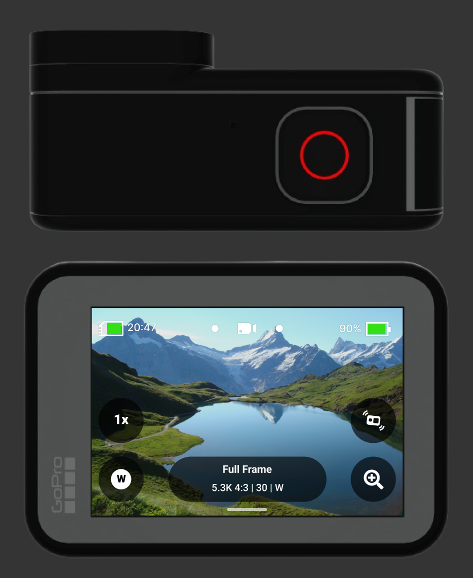
The figure below shows a digital mockup of the current interface of the GoPro Action camera (a).
In order to open up the video gallery the user is supposed to swipe up with their fingers.
This however is not immediately apparent, as there is no element that indicates the possibility to interact with the interface in such a way. The user would need to somehow already know that the video gallery is located “below” the main screen, and that through a swipe up gesture it’s possible to bring it up.
Two interface prototypes were created: a control interface, identical to the current one, and an alternative interface, with an added signifier.

(a) Digital mockup of current user interface
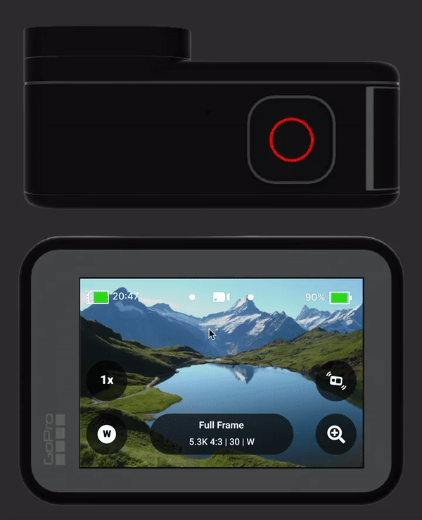
(b) Digital mockup of modified user interface
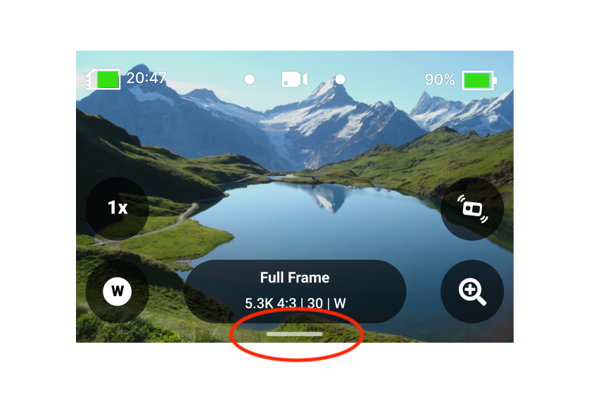
In the creation of the alternative interface the goal was to produce minimal changes while still effectively conveying the presence of the “swipe up” affordance.
The solution chosen was to add a subtle gesture indicator at the bottom of the screen (b). This slight modification is the only difference between the control group to the manipulation group.
This specific visual element was chosen as it is already commonly used as a swipe or drag indicator in other interfaces. One of its most noteworthy appearances, is as part of Apple’s design language.
It’s widespread adoption in other interfaces means that users may already be familiar with it, and may already have a mental model that associates that shape in that context (close to the edge of a screen) with the possibility to drag or swipe.
That signifier was chosen because of its use in other interfaces, where it is presented with the same meaning.
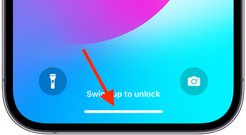
Use of the gesture indicator in an iPhone lockscreen
It’s also worth noting that this visual element is also already present, with the same meaning, in the GoPro Hero’s interface, in fact, it is used in the video gallery to convey the possibility of swiping down to go back to the main screen.
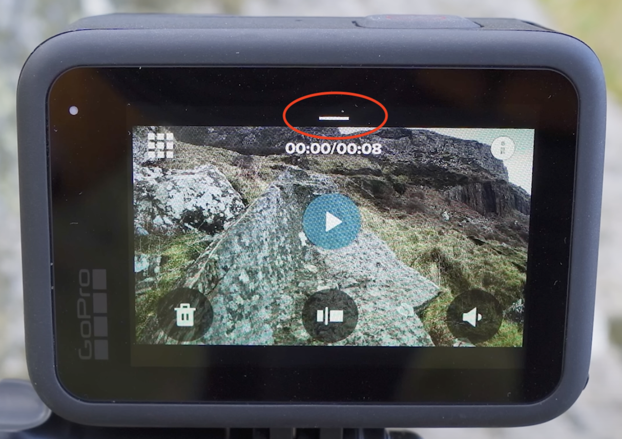
The gesture indicator is already present in other parts of the GoPro interface.
Methods
The study was conducted as an unmoderated usability test, administered through the Lyssna user testing platform.
Only participants who had little to no experience with GoPro Action Cameras were selected for the experiment.
This is because it is assumed that expert users will already know how to complete the task, and the data collected from them wouldn’t be informative to assess the discoverability of the
interface. For more details on participants selection see the Full Report.
The study was conducted through a series of unmoderated usability tests, following a "between subjects" approach.
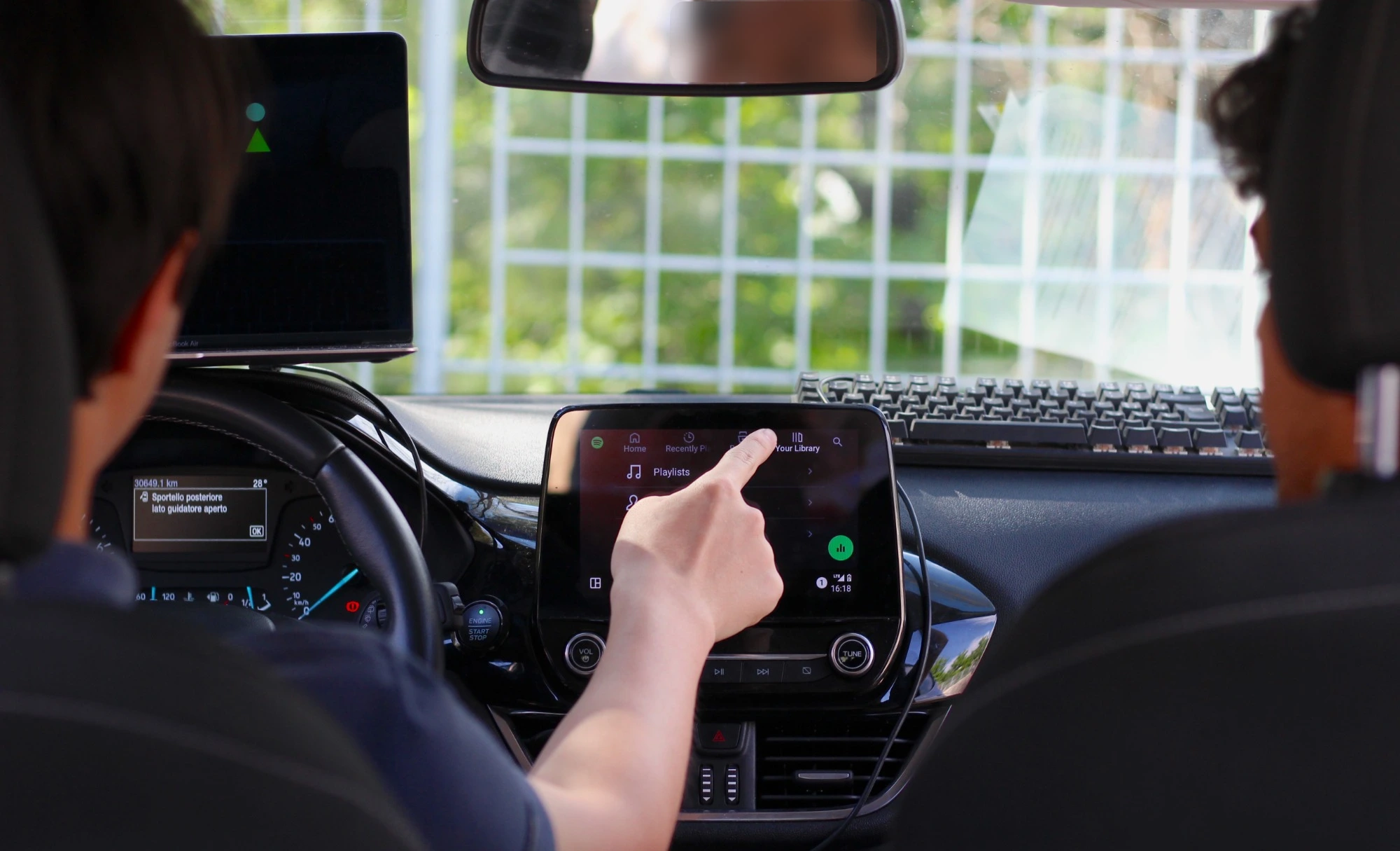
Participants were presented with an interactive digital prototype of a GoPro Hero action camera on which to perform a series tasks. In order to allow for interaction with physical buttons present on the top of the camera, both a view of the touchscreen as well as a top view of the device are shown in the prototype.
In addition to the touchscreen, the prototypes allowed participants to interact with the physical button of the device.
Interactive digital prototype used in the study
Tasks
In the first task the participants were asked to record a video, by pressing the “record button” and then pressing it again to stop the recording.
The purpose of this tasks wasn’t that of gathering performance data, but to show the participant that after a video is recorded an animation shows the video “thumbnail” sliding down.
This is an important clue for the user as to where the video gallery may be located, and as such, it was important to also present it in the study.
Task 1 was meant to show participant the animation triggered when a video is recorded, as it gives clues about where the gallery may be located.
What the user sees after recording a video
The second task was the one where performance data was actually gathered.
Participants were asked to open the video gallery and play the video they just recorded.
Here for each participant we gathered objective measures of task performance (completion and time-on-task), and subjective measures of perceived task difficulty (SEQ questionnaire).
In Task 2 participants were asked to open the gallery, and task performance data was recorded.

Second task (alternative interface)
Data Analysis
To test hypothesis H1 and H3 for significance, the group means were compared with a series of independent one-tailed T-tests.
To test H2, a Chi-Squared test of independence was performed.
All tests were performed with a significance level 𝛼 = 0.05 and to account for multiple hypothesis testing, p-values were adjusted with Bonferroni’s correction.
Results
Although the alternative interface performed slightly better in some metrics, no statistically significant difference between the control group and the manipulation group (alternative interface) was found for time-on-task, completion rates or SEQ Scores.
24 participants took part in the study. 12 of them were assigned to the manipulation group, and 12 to the control group. Out of the 12 in the manipulation group, 10 were eligible to participate (based on their level on experience with GoPro action cameras) and out of the 12 in the control group, 9 were eligible to participate.
For all three hypothesis the results of the statistical tests came out as inconclusive (𝑝 > 0.05), so we are unable to say if the proposed interface is better, but looking at the data we can see that the two interfaces performed similarly, and on the whole quite badly.
Completion rates were 80% for the control group and 89% for the manipulation group.
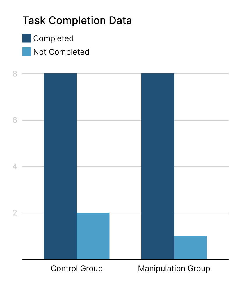
Task completion
Average time on task is 36 seconds for the control group 38 seconds for the manipulation group, by removing outliers (participants who didn’t complete the task and spent a lot of time trying, up to two minutes) these figures go down to 26 and 28 seconds respectively.
The data does however show that there are clear discoverability issues in the interface.
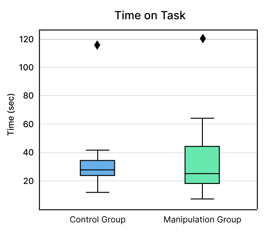
Time on task for the two groups
The fact that participants, on average, spent upwards of 25 seconds to understand how to open the video gallery is an indicator that neither of the two interfaces reaches a good standard of discoverability, and validates the necessity for the improved interface that is advocated for in this study.
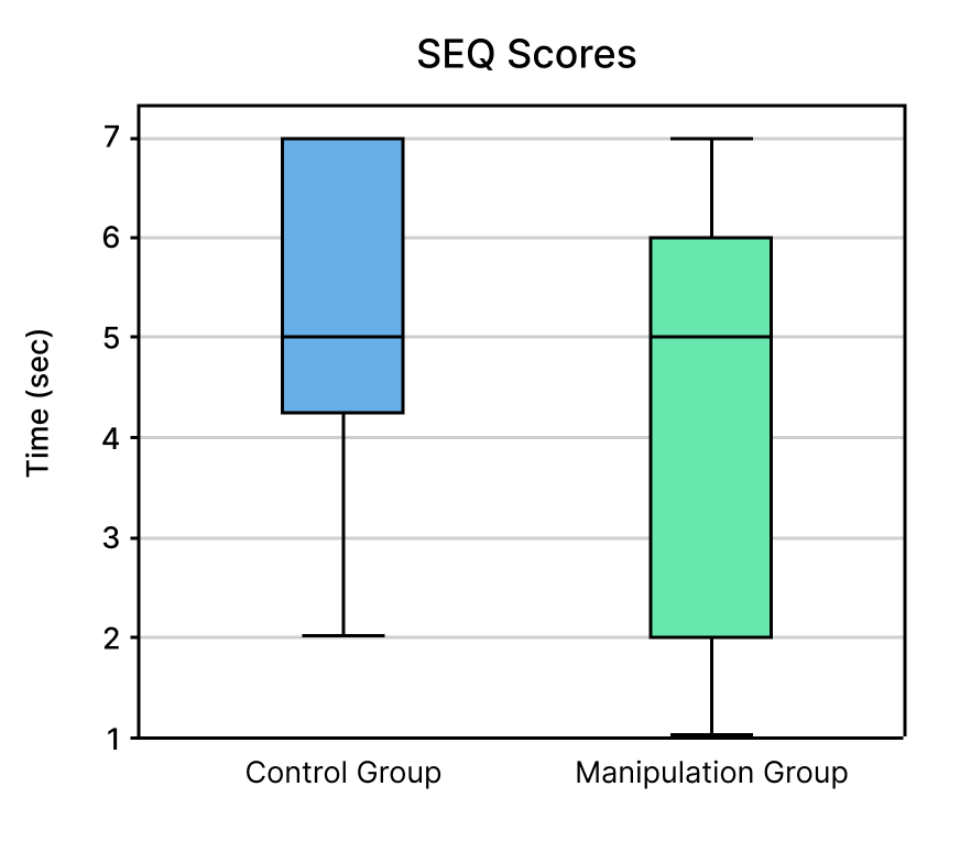
SEQ scores for the two groups
SEQ scores were also similar, with the control group averaging 5.1 and the manipulation group averaging 4.4.
Discussion
While the UI of GoPro’s action cameras lacks a signifier, it’s hard to imagine that designers at GoPro are unaware of the potential issues stemming from this. It is instead likely that their choice to design the interface in that way was intentional, and we can make educated guesses about why they made that choice.
Firstly, the touchscreen on a GoPro is rather small, and screen real estate comes at a price. Adding a visual signifier for the video gallery could take away some of that space from the main screen and add “visual clutter”.
The absence of a signifier is likely a conscious design decision from the GoPro design team.
Secondly, the camera actually does tell you were the video gallery is, and how to bring it up. When the camera is turned on for the first time and the first video is recorded, a tooltip is shown to the user teaching them how to open the gallery (See Figure 9)In conclusion, this study doesn’t manage to propose a valid solution to the problem, but does manage to confirm its existence and quantify its magnitude.
A number of other alternative interfaces are possible, and should be tested in future research.
Full Report
References:
1. The Design of Everyday Things - Don Norman
2. Using swipe to trigger contextual actions - Angie Li
(Complete reference list in the Full Report)